This week I read the article “I was asked to invent the next Wordle. How hard could it be?”, and I thought it was really interesting because it showed how difficult it actually is to make a game that feels simple, fun, and addictive or worth coming back to at all. Before reading it, I honestly assumed games like Wordle were probably made pretty quickly because the concept itself seems so straightforward. The article made me realize that a lot of work goes into balancing difficulty, making rules understandable, and creating something players actually want.
One thing I especially liked was seeing the brainstorming and testing process behind the game ideas. There were a lot of concepts that did not work right away, and I think that relates a lot to design in general. In class, we are always experimenting or revising, and changing ideas, and this article reminded me that creative projects almost never come out perfect on the first try. Sometimes simplifying an idea or changing one small interaction can completely improve the experience for the user.
I also thought it was interesting how much psychology and user experience affects games. Small details like timing, challenge level, and feedback can completely change how satisfying a game feels. As someone who enjoys both games and design, I think this article helped me appreciate how much invisible work goes into creating experiences that feel effortless to the player. It made me think more about how good design is often much harder to create than it looks.
Post 3 — Visual Thinking Continued
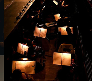
Image by Estefania Gomez, 2026
For this Learning Journal post, I was assigned to practice closely analyzing an image through visual thinking rather than only looking at what is immediately obvious on the surface. Although I was not able to participate in the in-person class feedback session, Estefania kindly gave me permission to analyze and use one of her images for this assignment (shown above). This process made me think more carefully about how lighting, composition, and perspective can completely change the emotional tone of an image and influence the way viewers interpret it.
At first glance, this image appears to be showing an orchestra rehearsal or performance, but the lighting and perspective make it feel much more mysterious and almost cinematic in a way. The dark environment causes the glowing sheet music to become the main focus of the composition, floating and almost making the musicians themselves disappear into the shadows. This creates an interesting contrast between visibility and invisibility. The viewer can clearly see evidence of collaboration and performance, yet the people creating the music feel anonymous and distant. The diagonal perspective also guides the eye through the image in an unusual way, making the scene feel much more alive as opposed to just flat.
I think the most interesting aspect of the image is the atmosphere created through lighting and composition. The warm lights reflecting off the music stands create small islands of brightness surrounded by darkness, which makes the image feel emotional and slightly suspenseful, maybe like this is the big moment before something impactful is about to happen. The image definitely makes me wonder about what is happening outside the frame and what kind of music is being performed. To push the visual storytelling further, I think experimenting with motion blur, contrast, or even closer cropped perspectives could make the image feel even more expressive and poetic. Additional focus on individual gestures or instruments could also create a stronger sense of narrative and emotional tension within the performance space.
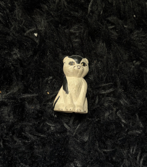
Image by Emily Fuller, 2026
This image is interesting to me because, at first glance, it just appears to be a small ceramic cat placed on a dark background. However, the meaning behind the object completely changes the way I view it. My dad and I named this cat “Sprinkles” when I was around six years old after my dad gave it to me before school one day because I was nervous about going. I vaguely remember him telling me the figure originally belonged to his grandmother, which gives it a sense of history and emotional importance that would not be obvious from the image alone. Even though it is a very small and simple object, I associate it deeply with comfort, imagination, and childhood memories with my dad. The worn texture and slightly uneven paint also make it feel more personal and handmade, almost like an object that has quietly existed through multiple generations. She is very important to me and I bring her wherever I move!
This image connects to my archive because my project I think will be on creating an interactive “I Spy” style collection of unsuspecting objects that tell stories about me and the way I interact with the world. Many of the items I chose are tied to memories, emotions, or small narratives, and this ceramic cat represents that especially well. Together, the collection will reflect how I am a very sentimental person, and I tend to form emotional attachments to objects and create stories around them, even when the objects themselves may seem ordinary to other people. If I were to improve this image further, I would experiment with more intentional backgrounds, lighting, or staging to make the object feel even more mysterious and immersive, maybe putting it on a shelf or putting it into a setting more relating to it's background. Right now, the dark fuzzy background creates a neutral background, but placing the figure within a more constructed environment or scene would probably strengthen the storytelling. I am pretty excited for this project and an opportunity to share my trinkets!
This week made me realize how much I usually rush through images without really thinking about them. The article (“10 Intriguing Photographs to Teach Close Reading and Visual Thinking Skills”) talks about treating images almost like a mystery, where you slow down, look closely, and try to figure out what’s going on instead of jumping to a quick conclusion. I liked the idea of being a “detective” because it makes visual thinking feel more active and engaging, and I think phrased it in a way many could understand.
I saw this a lot in this website I found on a reddit post about cool websites that people enjoy, called "recollection" by "Because Music". At first, before even pressing play, I wasn’t really sure what I was looking at, but that’s kind of the point! It drew me in because it reminded me of the article, where at first I made some assumtions about the site that I actually wasn't too sure about. The visuals pull you in and make you curious, so you want to interact with it and figure it out. Once I pressed play, everything became more dynamic, and I started to understand it with exploration instead of just being told what it is.
I think the biggest strength of the site is how immersive it is. I think it makes you experience the visuals instead of just looking at them. At the same time, it could be a little confusing or overwhelming at first, especially if someone expects something more straightforward. For me, it led me to the conclusion that good visual design doesn’t always explain everything right away, and it can also create curiosity and make you want to explore more.
After reading “Best Practices for Modals / Overlays / Dialog Windows,” I now see how common modals are and how often they can be frustrating when used poorly, I definitely have found them frustrating at times. The strongest point to me was that modals interrupt the user’s flow, so they should only appear when something *really* important needs attention or when input is necessary, such as logging in or confirming an action. If they are overused, users start closing them automatically without even reading them, I know I definitely have.
I also thought the discussion of accessibility was important. I had not considered how keyboard users or low-vision users experience modals. Features like clear close buttons, keyboard navigation, and focus being moved into the dialog can make a major difference in usability. It reminded me that good design is not only about appearance, but about making something functional for as many users as possible.
After reading the article on form design, I started realizing how many small details actually affect whether someone finishes a form or just gives up. I personally am a person who gives up on forms pretty easily, and will usually find a way around them or just end up not doing them at all. I think one thing that stood out to me the most was how important it is to keep forms simple and only ask for what’s necessary. I’ve definitely clicked out of forms before because they felt too long or overwhelming, and especially if I had to repeat information multiple times, so that really made sense to me. I also liked the point about showing errors right away and clearly explaining how to fix them, because I understand that it can be extremely frustrating to get to the end of a form, long or short, and then get told something is wrong, but being unsure what.
Another takeaway for me was how much structure matters. Grouping related questions and having a clear flow makes everything feel easier and more intuitive. It reminded me of what we’ve been talking about in class with usability also, good design should guide the user without them having to think too hard about it.
A website that I think does a good job with forms is LinkedIn, although it seems kinda heavy with information, I think It’s really straightforward, easy to follow, and gives clear feedback if something is missing. I really love that everything when making your profile or applying to a job is in digestible sections, which I think a lot of forms can lack. I think this article was a great way for me to reflect and be more aware of how thoughtful design can make a simple task feel either smooth or super frustrating.